
 Türkçe
ISTANBUL
LOCATION
YEAR
–
COMPANY
HAS KUTU
PROGRAM
FAIR
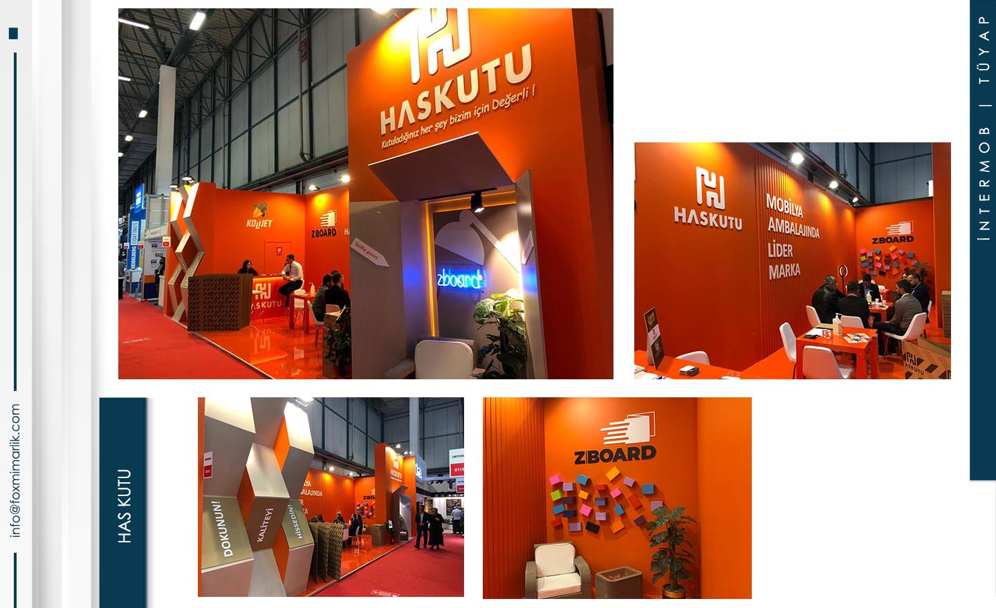
Has Kutu: Visual Aesthetics and Modular Presentation in Packaging Design
Within the scope of the Intermob Fair organized at TÜYAP, this stand we implemented for the Has Kutu brand has a “product-oriented” architectural approach that meticulously presents the brand’s extensive product range as design objects. The design brings together the detail-oriented structure of the box and packaging world with a modern and orderly display language.
Graphic Power and Corporate Identity
The large graphic panels used on the exterior facade and ceiling band of the stand make the sectors the brand serves and its production capacity visible from every corner of the fair. The balanced use of corporate colors and high-resolution images ensures that the stand has a professional and inviting atmosphere.
Rhythmic Shelving Systems and Focused Lighting
The modular shelving systems located in the interior present the brand’s box designs in various sizes and forms in a rhythmic order without chaos. The linear lighting integrated into each display unit highlights the products’ forms and print quality, offering visitors a detailed examination opportunity.
Functional Communication Areas
The wide reception counter that will manage visitor traffic smoothly and the comfortable meeting areas positioned in the interior section provide a professional setting for long-term commercial meetings. The stand’s open floor plan creates a spacious movement area even in a crowded fair environment.