
 Türkçe
ISTANBUL
LOCATION
YEAR
2023
COMPANY
BENEFIT
PROGRAM
FAIR
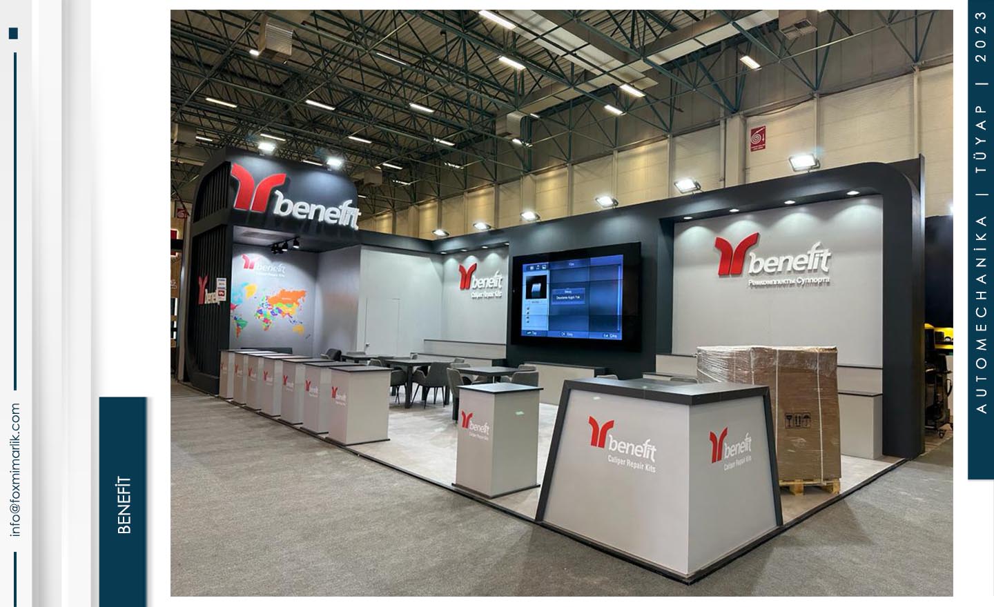
Benefit: Strong and Technological Presence in the Automotive Industry
The stand we implemented for the Benefit brand within the scope of the Automechanika Istanbul Fair expresses the professionalism and sense of trust required by the automotive aftermarket sector through an architectural language. Sharp forms, contrast color usage, and technological integration constitute the main backbone of the project.
Corporate Identity and Dynamic Forms
In the design, the balance between red, black, and white, which are the corporate colors of the brand, was meticulously orchestrated. The curved black frame located at the entrance of the stand and the enormous “Benefit” logos create strong brand awareness within the fair area. The world map graphic placed in the background directly emphasizes the brand’s global vision and extensive export network.
Digital Integration and Functionality
The large digital screen positioned at the center of the stand allows the brand to dynamically present its technical solutions and product introductions. Product display counters and the reception area are arranged to optimize visitor flow. Meeting areas with open sightlines provide both spacious and professional grounds for corporate meetings.
Industrial Aesthetics and Lighting
The anthracite surfaces used in the overall structure symbolize the industrial nature of the automotive sector, while powerful spot lighting that complies with the high-ceilinged fair area elevates product display quality to the highest level. Thanks to illuminated counters (light-box), brand logos become noticeable from every angle.